Author Archives: Tara Maya
- by Tara Maya
St. Nick’s Favor
 |
| Read this on your Kindle. |
Everyone is welcome to please drop in to the virtual release party for St. Nick’s Favor, the sequel to Chasing the Trickster.
There will be novel and short story giveaways. And if I get it done there will be a book trailer for St. Nick’s Favor as well.
Blurb: St. Nicholas asks Nina Weaver to be his emissary. Her mission is to take a one-way trip five years into her past to save the lives of thousands of children. Doing this will result in her losing the life she has built in New York City, including her relationship with Pascal Guzman. Nina faces down corporate greed, attempts on her life and the terrors of the Trickster God to keep her promise.
Even if you can’t attend the party, please drop by to “LIKE” this new book. Or just buy it on Amazon.
- by Tara Maya
Beltane: Ten Tales of Witches
You can find more fab anthologies in the Ten Tales series here: Rayne Hall’s Dark Fantasy.
- by Tara Maya
The Car Antlers (Short Christmas Story)
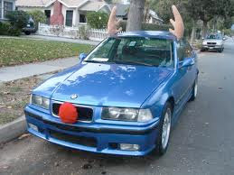
“What are these, exactly?” asked Bill.
“Antlers for your car!” said the checkout lady. She wore a red Santa hat at a jaunty angle. She wiggled her fingers on top of her head. “To make it look like a reindeer.”
He laughed. “Does it make it fly over rush hour traffic too?”
“Of course!” she smiled. “But only once, and only at just the perfect time. One miracle per antlers.”
“Why not?” Bill added the antlers to his other groceries.
He could use some Christmas cheer. Since his son had gone off to college and the beloved family dog, Mitts, had passed on to Doggie Heaven, the house had been quiet. Bill and the Misses didn’t even have a tree this year. The antlers would be his token decoration.
He fastened them onto his car in the parking lot.
The wind was bitter and brutal that night, and Bill had a long drive home. Suddenly, on an isolated road lined with trees, a branch dropped in front of the car. The car ran up it like a ramp, and literally jumped into the air, landing hard on the far side of the branch.
Shaken, Bill stopped the car as soon as he had control of the wheel again. He stepped out of the car to make sure there was no damage. One of the antlers had become askew.
“Hey, you made my car ‘fly’ but almost killed me in the process,” Bill complained to the antlers. “I don’t call that much of a miracle!”
Behind him, Bill heard a whimper. Startled, he turned around and found a puppy quivering in the center of the street. Bill looked at his car and then back at the puppy. He realized that if the branch had not made the car go flying r
ight over the puppy’s head, the dog would have been hit.
ight over the puppy’s head, the dog would have been hit.
“Hey you,” said Bill, kneeling by the puppy. “Where do you belong?”
The puppy licked his hand. She had no collar and her fur was scraggly. It was clear she had no humans of her own. She nuzzled Bill. He picked her up and cradled her in his arms.
“Nowhere, huh? Well, I guess I’ll have to take you home with me. And you’ll need a name too. I think I’ll call you…Miracle.”

Would you like to read this and other stories on your Kindle?
- by Tara Maya
Cover Reveal: A Vampire Carol and Other Christmas Tales
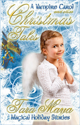
This will go on sale today or tomorrow. At the moment, it will only be available on Amazon and Scribed. The flash fiction pieces I’ve been posting on my blog are in there as well as The Dragon and the Angel, a short story (but not flash), an excerpt from the Unfinished Song: Root and an original urban fantasy novelette, A Vampire Carol.
I’ll have more excerpts up soon.
UPDATE: Now Available!
- by Tara Maya
My Cover Looks Like Crap! – Fix 03 – Font Bling
You could hire the most awesome cover artist in the multiverse, but if your text looks bad, your cover will look bad.
Case in point:
 |
| Bad. |
 |
| Good. |
So let’s talk font bling.
I use Photoshop, so I’m most familiar with how to treat text in that program. I’ll refer to how to do these effects in Photoshop, but I assume other equivalent programs can do similar things.
In Photoshop, right click on the text layer you want to enhance. Right under Layer Properties, you’ll see Blending Options. Choose that and a pop up menu will appear. In that menu, you’ll find most of the following options.

Here’s plain black text (Garamond Pro) on a medium dark colored background. We’ll gradually build up this text to experiment with various effects.

If you learn to do nothing else, learn to add a drop shadow to your text. The drop shadow alone can often make an amateur title look pro. Learn it, love it, use it.

Bevel and Emboss are what gives your text that 3D “pop.” Photoshop automatically adds the highlights to give these letters their depth. You can adjust the angle, but usually the out-of-the-box bevel and emboss looks fine. Again, just adding this, plus drop shadow, gives your text the self-respect it needs to hold its head high in the world of book covers.

Contour is like Bevel and Emboss, just a little more sharply defined. See that ridge down the center of the letters?

You can rough up your text a bit by adding Texture. This is easy to over-do, and too much Texture can make a font impossible to read, so consider subduing the effect by lessening the opacity or choosing a subtle weave from the Texture menu.

Inner glow can give a spooky or magical look to text. Not shown very well in this example. It works better with some fonts than others.

Another nice effect is Gradient. It’s important that the color scheme for your Gradient works with the rest of the cover. Also, consider the light source in the images on the cover (where is light “coming from” in the picture) when you decide which part of the lettering will be lighter and which darker.

The Stroke around the letters is one of the most abused of all effects. You’ll often see amateur covers with the text outlined in bright red, despite the lack of bright red in the rest of the cover, or any other justification for such garishness. Why? That’s the color it comes set on. This abuse means that you should think once, twice, three times before using Stroke. However, Stroke doesn’t have to be bright red…and usually shouldn’t be.

Outer Glow is probably the effect I use most often, after Drop Shadow and Bevel and Emboss. It helps the letters stand out. You can make it brighter for a “magical” look, or softer for a more subliminal effect.

In addition to Outer Glow on the Blending Options menu, there’s another way to make sure the text on a cover is legible. Often, if the text is over a picture, some parts of the picture are too light or too dark and the black or white text disappears. A dark blob or light blob underneath can smooth that out. Here, I’ve used the paint brush, black but with only about 20% opacity, to brush a shadow under my title. Make sure your shadow layer is underneath your text layer.

This is the same as above, except with a white, light airbrush under the title instead of a dark one.

There’s no simple, reliable way that I know of to make metallic letters in Photoshop. It takes several steps, finesse and practice. Here I’ve done my best to make the letters look gold by combining everything above (except Stroke) and then choosing the Gold combination under Gradient. I’ve then added white highlights of varying opacities by hand.

Once you learn the basic effects, you can mix it up to get interesting combinations. Here I’ve added Texture to the Gold to make a Rough Gold look.
- by Tara Maya
Guest Post: Wonder Weapons: Release the Magic
 Rayne Hall has published more than forty books under different pen names with different publishers in different genres, mostly fantasy, horror and non-fiction. Recent books include Storm Dancer (dark epic fantasy novel), Six Historical Tales Vol 1, Six Scary Tales Vol 1, 2 and 3 (mild horror stories), Six Historical Tales (short stories), Six Quirky Tales (humorous fantasy stories), Writing Fight Scenes and Writing Scary Scenes (instructions for authors).
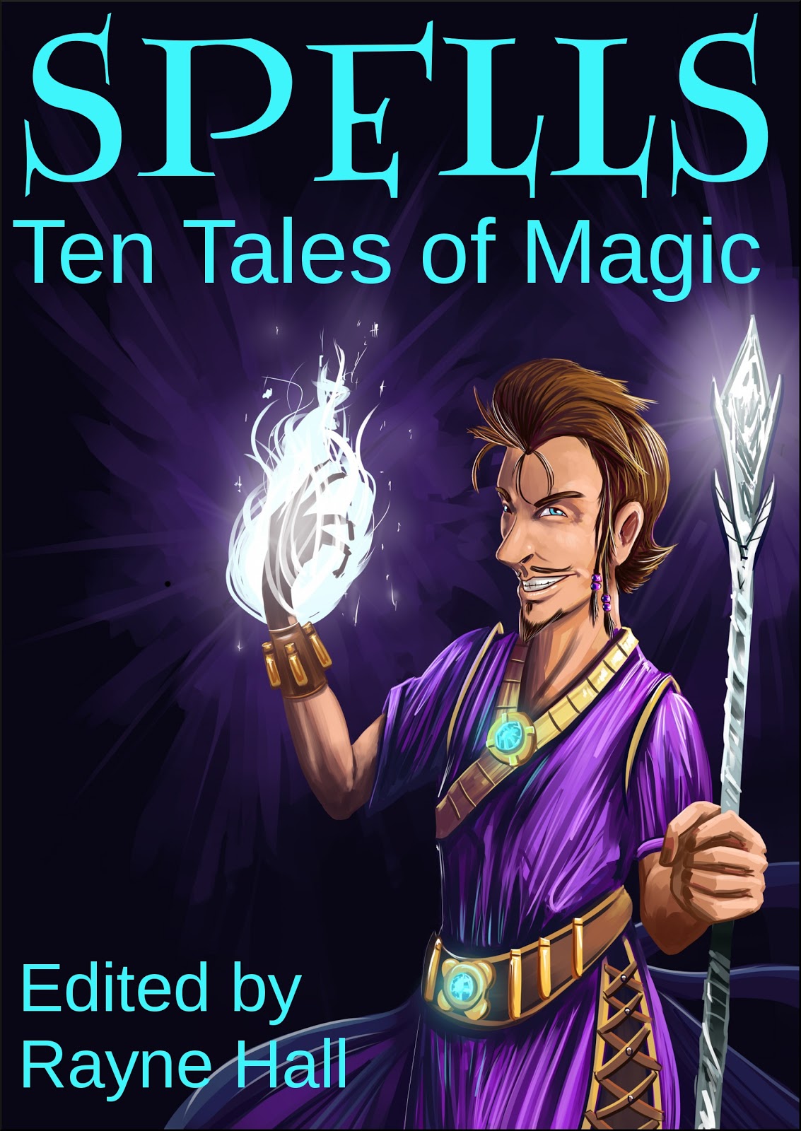
She holds a college degree in publishing management and a masters degree in creative writing. Currently, she edits the Ten Tales series of multi-author short story anthologies: Bites: Ten Tales of Vampires, Haunted: Ten Tales of Ghosts, Scared: Ten Tales of Horror, Cutlass: Ten Tales of Pirates, Beltane: Ten Tales of Witchcraft, Spells: Ten Tales of Magic and more.
Her short online classes for writers intense with plenty of personal feedback. Writing Fight Scenes, Writing Scary Scenes, Writing about Magic and Magicians, The Word Loss Diet and more.
For more information about Rayne Hall go to her website.

When writing paranormal and fantasy fiction, we writers can invent fantastic magical weapons. However, these weapons need to be interesting so they enrich the story, and believable so the readers can suspend their disbelief.
A weapon which can kill anyone, any time, is implausible and boring.
Here are some ideas how to create a magic weapon, inspired by real magic traditions from different cultures. Your weapon probably includes some, but not all, of these ideas. Have fun!
Material, Size and Shape
* The weapon is made from a solid, natural material: stone, wood, or bone. The bone could be from a ritually sacrificed animal, from a human ancestor, from a hero or saint, or from a slain enemy.
* It may contain a crystal, or a precious or semi-precious stone, because these are good at storing and intensifying magical energy.
* It has an elgongated shape, like a wand or a staff. Indeed, it may be disguised as an everyday elongated object, such as a pen or a walking stick. The magician points it at the target, similar to aiming a gun.
* The weapon can be of any size, from a tiny jewellery pendant to a tree trunk.Small items have the advantage that the magicians can carry them on their body or hide them in their garments. Large items may be stationary and everyone knows of their existence and location.
* There is probably a religious connection. For example, the weapon may be sacred to a goddess, blessed in a temple, manufactured by monks, invented by a god, given to the hero by a goddess.
* It is probably old, perhaps inherited through generations.
* It can only be given – for example, in gratitude by the craftsman who made it, or granted by a priestess on her death bed. It can not be bought with money.
* The manufacture of the weapon involved a ritual and a sacrifice. This may have been a human sacrifice. The weapon may have been dipped into the sacrifice’s blood.
How it Works
* Most magic works through the user’s mind. To activate the weapon, the magician needs to concentrate, perhaps think a certain sequence of thoughts. The use of a magical weapon is never purely physical (such as pulling the trigger on a gun). It’s the mental effort that counts. This can create interesting situations when the magician needs to concentrate to use the weapon, but can’t concentrate in the heat of the battle.
* The damage inflicted by a magical weapon may be invisible. It may kill without leaving visible wounds, baffling the doctors.
* Magical weapons may act slowly. A person may get hit by a magical weapon and not realise it until hours or days later, by which time it’s too late to seek help, and the person withers away.
* The weapon may affect the target’s mind rather than the body. For example, it may rob that person of the will to live, or of the courage to fight.
* Many magical weapons work on one of the elements (earth, air, fire, water). For example, the weapon may kill by shaking the earth on which the target stands, or by heating the air the target breathes.
* The weapon can hit targets which are hidden. Its energy can move through or around obstacles.
* The user needs training to wield the weapon. This probably involves training in magic (power raising, mental focus, directing energy), as well as training in the use of the specific weapon. In the hands of an untrained person, the weapon may be ineffective, or may kill the user.
Charging and Cleansing
* Before use, the weapon needs to be magically fuelled (the usual term for this is ‘charged’). This may be done in a certain place (at a spring, in a temple, at a crossroads) or by a certain person (a senior magician, a crone, a priestess). The charge involves a ritual, which may be simple or complex, and is often religious in nature. Sometimes, a weapon can be charged by leaving it lying in running water, or exposed to bright sunlight, or to the light of the full moon. If the weapon contains a crystal, it’s the crystal that gets charged.
* After use, the weapon needs to be ritually cleansed. This may be a simple act such as rinsing in running water, or it may need a prayer, or a complex ritual at the temple. The cleansing and the re-charging are often done in the same ritual.
Fictional Complications
* To be interesting, the weapon needs to have at least one weakness which causes difficulties for its user.
* After being ritually charged, the weapon works only for a specific period – perhaps for seven hours, or until the next new moon. After that period has passed, it may become inaccurate or less powerful, or stop working altogether.
* The weapon may only work in the hands of certain people: initiates of the order, male virgins, or post-menopausal crones. This can create interesting situations, for example, if it works only in the hands of a male virgin, the enemy may send a seductress.
* The weapon depends on the user’s attitudes and beliefs. What if the weapon works only for a user whose religious faith is unshaken? What if it only works for someone who is free from fear?
* In many magic traditions, the knowledge of names plays an important role. Perhaps the weapon works only if the user knows the target’s true name.
* In some magic traditions, especially modern ones, visualisation is important. Perhaps the weapon works only if the user can visualise the target’s face.
* The weapon may work only if the user is in a state of altered consciousness (i.e. in a trance); this can be tricky in a battle.
* Magic spells often take time. The user needs time to raise magical energy and to direct her will at the desired outcome. In an urgent fight situation, time may be short.
* Magic requires intense concentration. Perhaps this weapon needs several seconds of total concentration before every shot, and this concentration can be hard to come by in the heat of a fight.
* The weapon may work only in the presence of a certain element (earth, air, fire, water). For example, the user must stand near an open fire, or the target must be close to running water, otherwise it won’t work.
Enjoy inventing a magical weapon. I’d love to see what you come up with, and I hope you’ll post your ideas here. I look forward to helping you refine your fictional weapon.
If you have questions about writing fight scenes or about magical weapons, feel free to ask. Just leave a comment. I’ll be around for the next couple of days and will respond.