Archive
Monthly Archives: December 2012
Monthly Archives: December 2012
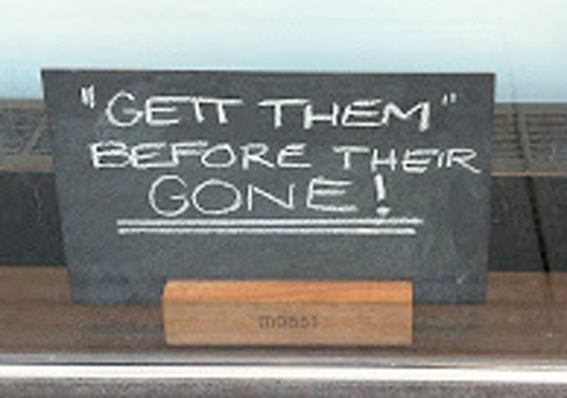 |
| GETT THEM QUOTE MARKS BEFORE THEIR GONE! |
I’ve been thinking about quotation marks.
I can’t remember if I’ve ranted before about how much I hate the convention in some literary books to leave quotation marks off of dialogue. (Probably I have.) Even if the book is in French, I hate it.
Now, I realize this is unreasonable. At first I thought that writers in the literary genre did this just to be annoying but then I realized that they probably did it to be French, and there’s a difference, albeit a subtle one. Americans trying to be French are annoying but not necessarily trying to be annoying. The French themselves are not annoying. (I have lived in France, and the point of this post is not French-bashing.) French literature has different punctuation conventions than English, and although I don’t like them, and I think our English quotation marks are vastly superior, I can’t blame the French for their silly ways. If I didn’t want to be exposed to the lack of decent quote marks in French books, I should have been a good American and never learned to read another language.
When I pick up a book in English, however, I don’t think it’s unreasonable to expect it to be punctuated properly.
 |
|||
| If this is honestly a mystery to you, review your basic rules here. |
Granted, punctuation rules change. I use “quote marks” along with the “quotation marks” and that’s probably sloppy. I’m not sure if putting a word in quotation marks always indicated sarcasm in English. (I imagine that “air quotes” are even more recent…wait, should air quotes have quote marks?) Also, it’s been clear from the ongoing struggle to teach the hand written sign posters of the world that apostrophes are a lost cause, so why should we expect any better fate for quote marks? Either that, or people who write signs are constantly given to sarcasm.
 |
| And by “police,” we mean Mrs. Betty across the street. She will “whoop” you. |
However, when I pick up a book by a “good” author, must I really pry my way through endless pages of quote-free dialogue:
I’m supposed to go to the hospital now, said Lisa, taking my hand.
Ann said: I’m supposed to go back to school and get picked up for ballet class.
Want to switch? Lisa asked, as we approached the park.
Sure, said Ann. Okay.
Lisa’s face lit up. Really? she said. Really?
Ann burst out laughing, total revenge exacted for all the pirate suffering she’d endured in the last hour.
No way, she said. I was only kidding.
It’s not that I can’t follow who’s saying what, but I feel less immersed in the reality of the story. This a magical realist story by Aimee Bender, An Invisible Sign of My Own, so perhaps that was her intent, but if so, I think it works against the rest of the story. The same is true for The Particular Sadness of Lemon Cake.
I don’t deny that are there are stories where this technique fits the whole zeitgeist of the book. In The Road, I think it fits perfectly:
He watched the boy and he looked out through the trees toward the road. This was not a safe place. They could be seen now from the road now it was day. The boy turned in the blankets. Then he opened his eyes. Hi, Papa, he said.
I’m right here.
I know.
It works for Cormac McCarthy because the narrator of The Road is already so distant and deadened that the lack of quotation marks fits the rest of his narrative voice. Quotation marks? Hell, the guy can’t even name his son … by his name or as “son.” He’s just “the boy.” Could a guy like that bother with quotation marks? It makes the whole story difficult, like reading underwater, gasping for breath, but that fits his post-apocalyptic vision. (Perhaps it’s also what Aimee Bender was going for, since her characters react toward ordinary events as apocalypses.)
However, I suspect that a lot of literary writers eschew quotation marks because they’ve seen other writers in their genre do it, and they take it for a convention.
This did get me wondering. If the lack of quotation marks serves to dehumanize characters, an abundance of quotation marks could anthropomorphize a landscape.
The road dared me, “You don’t have the guts.” My car begged, “Let me at ‘im, boss.” I slung myself into the seat, which groaned, “You could stand to lose a few.”
Hm. Okay, it could work, but it could also get tired very quickly. It would be something you’d have to establish early on in the book as a quirk of the voice, yet resist the temptation to overuse.
Or we could take our inspiration from grammar-free sign writers and make everything sound really sarcastic:
An “hour” later they were “on the road.” He pushed the “cart” and both he and “the boy” carried knapsacks. In the knapsacks were “essential” things. In case they had to abandon the “cart” and make “run for it.”
Yeah, that “works.”
There are so many fabulous book covers out there. And then there are the, um, less fabulous ones. What are the good cover artists doing that the amateurs aren’t?
Granted, sometimes the difference is twenty years experience painting fine oil portraits. But so often the fix is not hard at all.
Today I’m going to look at a few examples of covers that make excellent use of white negative space. That’s not space that you feel bad about, it’s the white around the print and picture. (It doesn’t have to be white and not all white covers rely on negative space.)
Here’s some gorgeous examples:


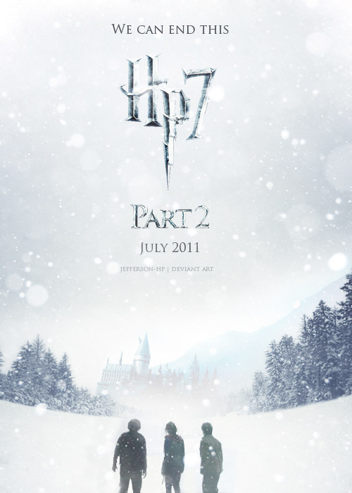
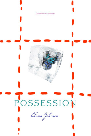
Aren’t these lovely? All that white, and yet look how much variety there is. In the first example, we have soft, pillowy white…you could just sink into it. The second is icy, hard and claustrophobic. It makes you want to break free. The third is snowy, expansive and hints at a vast, mist-shrouded destiny just over the next hill…. There’s an omen of storm and darkness the three small figures must face all alone.
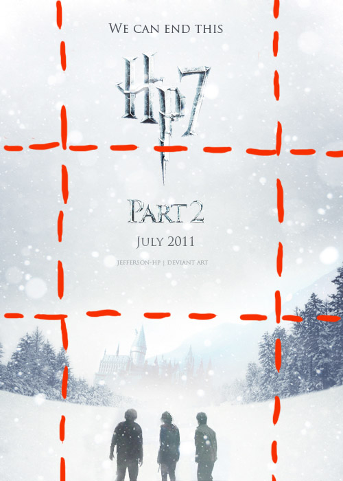
Now let’s take a peek at the structure behind the design. Notice the use of thirds.

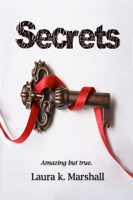
Ok, now how does this help us? Well, now it’s time to look at a book that does it wrong. This is a cover off Smashwords. I haven’t read it and haven’t been asked by the author to fix it. Obviously, it’s just my personal opinion that it looks wrong. But here we go:

If you compare this to the covers above, I hope we can agree that it just doesn’t look professional.
The question is: Why?
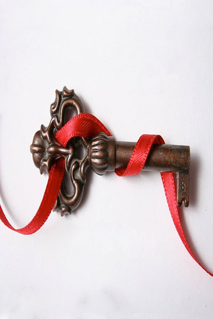
First, let’s look at what it has going for it. This cover is not too bad, as indie covers go. The artist has a clear design vision: a simple, symbolic image and a clean, spartan use of white negative space. The red ribbon provides color and diagonal movement to add interest. The font is legible and the title is large enough to read easily.
Yet the final result still looks haphazard, and my sense, correctly or not, is that the artist found a stock image and tossed on some titling. The key has a shadow, but the font doesn’t. The author name is shoved into the far bottom left corner. The size isn’t so much the problem as the fact that it is so squished into the corner. Sometimes placing a name or title off to one side can balance out another diagonal element in the design, but here, under the centered key, it’s not clear why the name is left aligned.
Another problem is that the size of the cover is not standard. Some indie author / artists do this on purpose to make their book “stand out” amongst other books in an online store, but the result, to me, always looks like a mistake, and therefore amateur. It looks amateur here too.


That’s the fix. A few simple steps, and the same cover looks much more professional. Maybe you disagree, but I personally wouldn’t be able to look at the cover above and immediately peg it as self-published, the way I could with the original version.
Does this cover still have some problems? Maybe. The background is still quite sterile. You’ll notice the professional examples have subtle artwork and shading around the edges that give them depth despite the overwhelming white. Another curl of the ribbon might add that extra something-something to this cover.
Another problem, which bothers me more, is that I have no idea what this book is about from the cover–not the genre, nor even whether it’s fiction or nonfiction. You’d think that “amazing but true” would indicate a work of nonfiction, but honestly, I have no idea. Secrets about what? The cover doesn’t tell us, the title doesn’t tell us, the tagline doesn’t give a clue.
However, these problems–sterility, ambiguity–are problems to a certain extent with the professional covers as well. It is one of the dangers of the spartan look of white negative space. Especially for fiction–white covers often signal nonfiction.
When I looked at the cover of Destined, the feminine font, common to YA titles, combined with the young girl in a beautiful dress, made me think this was a YA paranormal romance, and I was right, but I certainly wouldn’t have guessed it was the story of Psyche and Cupid. I still don’t know if it’s supposed to take place in ancient Greece (hint: they didn’t have sofas like that) or in modern times.
The Harry Potter poster is even worse. It doesn’t even spell out the title. They expect you to recognize the font! Of course… I did.
The thing is, if you are an unknown author, you can’t expect to have readers know your subject instantly the way millions of Harry Potter fans will. A few more hints would not be awry.
A great editing technique on QueryTracker Blog:
First, I take an honest inventory of the areas of writing that aren’t my strong suit. I make very sure to assign each of those a color. Then I look at what things I might go a little overboard on and add those to the list. Lastly, I add the things that are important structurally to the story.
Then I assign each item a color. So my list might look something like this:
Dialogue (You could even do separate colors for each main character if you wanted to.)
Description
Metaphors
Similes
Adjectives
Adverbs
To Be Verbs
Pacing
Characterization (Here, I would assign each major character and important side characters a color. If I’m running low on colors, I would assign a color and add bolding, italicizing, changing the font, or underlining.)
Inciting Incident
Clues that tie in together (I would be specific here. For example: All the clues that hint at the hero’s destiny.)
World Building
Story Arcs (I’d assign each arc a different color. Again, if you’re running out of colors, look at also bolding, italicizing, changing the font, or underlining to help differentiate the different things.)
Things Building Up to the Climax (I’d be specific here.)
Parts that Build/Release Tension (Might want to do a separate run through for this one.)
Words I Overuse
This is by no means an exhaustive list, just some ideas to get you started…
Read the rest: QueryTracker Blog: Visual Editing: Color Coding Your Way to a Cleaner Manuscript


The Innocent Flower: Bonded Novellas Now Available Separately + Buy One…:

Rayne Hall has published more than forty books under different pen names with different publishers in different genres, mostly fantasy, horror and non-fiction. Recent books include Storm Dancer (dark epic fantasy novel), Six Historical Tales Vol 1, Six Scary Tales Vol 1, 2 and 3 (mild horror stories), Six Historical Tales (short stories), Six Quirky Tales (humorous fantasy stories), Writing Fight Scenes and Writing Scary Scenes (instructions for authors).

The Other Side of the Story: Too Much of a Good Thing: Over Plotting Your Novel…: By Janice Hardy
Showing All Sides, But Still Needing More
Layers are good, but adding plots to show another side or perspective because you feel the reader just won’t get it if you don’t should make you pause. Your instincts are in the right place – you know you need more to make the story work – but you’re looking wider, not deeper, and adding things that likely only explore the idea. Are you: