Archive

Monthly Archives: December 2012

Amazon and Google Open Digital Bookstores in Brazil

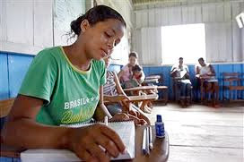
Excited Brazilians cheer the news they will get Kindles.

(Reuters) – Amazon.com Inc and Google Inc both opened their digital bookstores in Brazil on Thursday, hot on the heels of e-book offerings by local booksellers in a fast-growing online retail market.

The simultaneous introduction of the two services highlighted the wide-open nature of Brazil’s $12 billion e-commerce market. Low Internet penetration and a swelling middle class have spurred bets on strong growth for years to come.

Amazon will begin selling its Kindle e-book reader in Brazil in coming weeks for 299 reais ($140), the e-commerce powerhouse said, ending months of speculation that it could arrive by acquiring a major competitor.

Google books could really come in handy at this school in Brazil.

(Register) Amazon has entered the Brazilian market by launching Amazon.com.br – but it will just sell Kindles and ebooks to see if a digital-only operation can sink or swim.

…While Amazon staff working on the project view the event as a rousing success, it hasn’t been without its setbacks. The Kindle itself was originally slated to go on sale today, however the units were held up in customs. Amazon Brazil will have to make do with app sales through the holiday season.

The Brazilian operation is a trial run. If successful Amazon will have created a template from which to begin selling in new markets as a digital-only operation, decoupling the launch of Kindle variants and associated ebooks from the business of setting up and running physical warehouses and distribution centres in a country.

The Christmas Palm Tree (Short Christmas Story)

All the trees in the lot were excited. They couldn’t wait to be Christmas trees!

If only their lot weren’t so far away from anything, off a freeway from California to Nevada. They could see the cars on the freeway, but it seemed the cars couldn’t see them. Cars whizzed by, but none stopped at the Christmas tree lot. All the trees could do was dream.

“I hope I will be decorated in gold!” said Cedar.

“I hope I will be decorated in silver!”said Fir.

“I hope I will be decorated in red and green!” said Pine.

“I don’t care how I’m decorated,” said a voice from far above all the rest, “as long as I can be a Christmas tree.”

For a moment all the trees on the lot were confused. Where had the voice had come from? They looked up and saw a tall, tall palm tree, which grew at the side of the lot.

Cedar, Fir and Pine began to laugh. “You’re a palmtree! You can’t be a Christmas tree!”

“Why not?” asked Palm.

“You aren’t an evergreen!” said Cedar.

“You are too tall to fit in a house,” said Fir.

“You don’t have any branches to hang ornaments,” said Pine.

They all laughed again. Palm bowed his head sadly.

Spruce spoke up. “Hey! We all want to be Christmas trees…but we aren’t being very Christmas-y, are we?”

Cedar, Fir and Pine stopped laughing. They looked at each other.

“You’re right, Spruce!” Cedar said.

“No, you’re right,” said Palm. “I’m too tall and all I have are broad palm leaves…how could anyone decorate me or fit me in a house?”

“You are green all year long, at least!” said Spruce.

“We’ll help you, Palm,” said Fir. “We’ll decorate you ourselves!” 

Pine scratched his head with his branch. “But how will we hang ornaments on him?”

“Lights!” cried Spruce. “We will wrap him in lights!”

That’s just what they did. They took a string of lights from the fence around the lot and wrapped them round and round the tall, tall trunk of the palm tree, right up to the top. Then they placed a big star right on top of his head.

“You’re a real Christmas tree now, Palm!” they all cried. “How sparkly you are!”

“He will probably be the only one of us who does get to be a Christmas tree,” said Fir. “Since no cars ever come here.”

But as soon as Palm turned on his star and his lights, a strange thing happened. Car after car turned off the freeway and drove to the lot. Children ran out of the cars and pointed to the tree they wanted to take home.

The trees were so happy! One by one, they were all chosen to be Christmas trees.

“Palm! We owe this all to you!” they said. “You are so tall that all the cars could see your lights! Thank you so much! You turned out to be the best Christmas tree of us all.”

The tree friends all went their separate ways, to bring children joy and beauty on Christmas Day. At last, only Palm remained. After Christmas, the lights came down and the star turned off.

He was all alone. He missed his friends.

Then the true miracle happened. Santa himself arrived in his red sleigh the day after Christmas.

“Palm tree, Christmas is over for this year. I wanted to tell you about your new home!”

“My new home?” asked Palm.

“Didn’t you know? Any tree who is a Christmas tree gets to live forever after in Christmasland at the North Pole.”

“Wow!” said Palm. He tried to step into the sleigh, but his roots were stuck in the ground. “Uh…”

“Ho ho ho!” laughed Santa. “Whenever you’re ready!”

So for many years, Palm stood next to the lot, every Christmas, telling all the distant cars where to find trees, until at last, he too was ready to go live with all his friends in Christmasland.

Would you like to read this and other stories on your Kindle?  

My Cover Looks Like Crap! – Cover Fix 02 – Text As Art

Let’s say you have to make a cover on the cheap. You’re an indie author, for instance, and you foolishly blew your cover art budget on a bowl of instant ramen noodle. Tsk tsk tsk. Always thinking with your stomach!

Your first plan was to hire Stephan Martinière to paint an original scene from your novel. That fell through when you found out it would cost more than your monthly mortgage payment. So now you’re back to making your own cover.

Anyway, you figure, no biggie. You don’t need a scene from your novel anyway. What could be simpler than throwing the title over a moody picture and calling it a day? Lots of covers are no more than text over a vague scenic background or abstract pattern… right?

Right!

But if you want to go this route, you have to realize two things:

1. You’ll be using text as art.

2. That’s a lot harder than it sounds.

So you can’t just slap your title up in Times New Roman or Papyrus and expect that to look good. In a sense, you need an even BETTER grasp of basic design principles if you are going to rely on text and font to do your work for you.

First, let’s look at some examples where it’s done with elegance and aplomb.

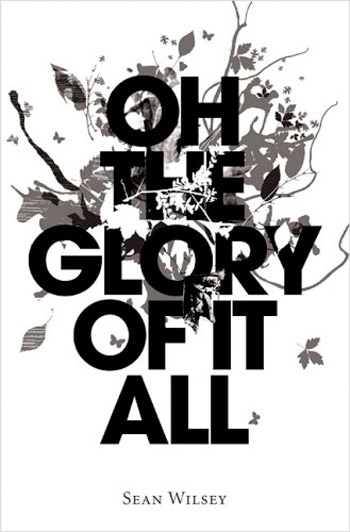
Wow, isn’t the simplicity of this cover amazing? It’s minimalist, including only title and author, and there’s no image at all, except the frown created by the text itself and the bright yellow color. Because the yellow smiley face is an icon, this cover works against our expectations, exactly as the subject itself does.

By the way, this is also a terrific use of negative space.

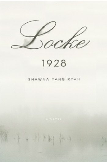
Again, this cover has only title and author. The title takes up most of the cover. Look closely and you’ll see that the artwork behind the text, despite the subtle grayscale tones, is quite complex. Notice how it is not completely behind the text either, but occludes the lettering in places. At first, it seems to be nothing but leafy scribbles, but study it. Do you see the butterflies? The unicorn?

I love the ambiance of this cover, and the way it moves smoothly from cool oceanic colors to warm, atmospheric colors. Yet the light pink sky darkens just enough at the top edge and corners to balance the darkening of the bluish hues below. Title & author are all that appear, as in the two previous examples. The others used only two different fonts. Notice–this one uses three. That’s fine, because there’s nothing messy or unplanned here, despite the casual, script-like fonts for the title. Do you notice how the letting in the title also moves from warm to cool colors?

Also, the author’s name is done right: drop shadow, spacing, font, everything is clean and crisp.

The first time I looked at this, I took the lower pattern to be waves… I was completely taken in by the optical illusion, brought on by partly by the title, and partly by the iconic nature of sun-sets-over-the-sea photos, that I was looking at a stylized ocean under a setting sun. Only as I looked a second time did I see that the ocean is actually made of coins. How intriguing….

By the way, this was a self-published book which was later picked up by a traditional publisher. This was the original, self-published, cover.

The artwork is literally beaded into the title. This is another two-font title, with the BLACK overlapping the purple HEART. The author name uses yet a different font (or possibly a variation of the font used for Heart) and the boast line (“New York Times Bestselling Author”) yet another font. Normally, you want to be leery of too many fonts, but in this case, they are close enough and conservative enough that nothing jars. Besides, there’s little on the cover besides text, so font fun is not a distraction… it’s the main event.
It goes without saying (I hope) that the artistry it took to integrate the beaded portraits with the font requires considerable talent.

 This cover looks deceptively simple at first glance. The cover looks almost white. (Originally, I was going to use this as an example in my negative white space post.) Peer deeper and the reeds in the misty lake gradually resolve. Notice too, the smudges around the title. This may have come with the font, but this is not a font you’ll find preloaded on your computer. Font artists deserve to be paid like everyone else, and buying fonts can cost anywhere from $30 to $150 to $5000. There are also free fonts you can download. 
Did you notice “A NOVEL” in white down there in the gray mist?

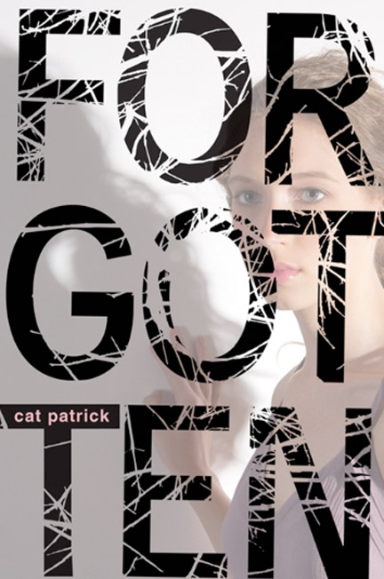
Here’s a cover which has a layer of text which fills the whole cover…and behind it, pale so as not to compete directly, an image of a girl and a shadow. (Notice her eyes are carefully placed so they are not obscured, however, and also that they hit the two thirds mark.)

The broken font fits the theme of the book, hinted at by the title. The author name is so tiny that a bit of red has been added to make it stand out more. This is one of the few times that a red stroke around text is not a bad idea.

By the way, when you block out the thirds of the cover, look how nicely FOR GOT TEN works out:

Imagine that!

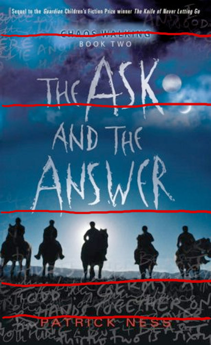
Here’s a more complicated cover.

As in our other examples, the main “image” is the title itself, in a disturbed, unsettled font. In addition, however, we also have a lot of other information on this cover. There’s the name of the series (“Chaos Walking,” the fact that it’s Book Two, and, in case some people still didn’t get it, the written reminder that this is the sequel to The Knife of Never Letting Go.

But wait, there’s more. We also have the main picture image, of five persons on horseback. A sky with two moons. A lot of crazy-weird scribbled words like “Todd” and “Germs” and “Over” which make no sense, but are disturbing and unsettling, just like the main font (though these are in a different “handwritten” font). The author’s name risks being lost in that mess, so it’s picked out in red.

All the books in this trilogy have fairly long titles. A design like this, which gives the lion’s share of the cover to the title rather than to a scene or a portrait, works well with long titles. Notice that the title takes up almost the entire top two thirds of the cover, and the other cover information takes up the rest.

As before, I will now take a random book cover off Smashwords and, utterly uninvited (and unpaid), redesign it.

Here’s what I’ve chosen as my sacrificial victim:

I chose this cover because it has a lovely image and a vivid title. Also, I’m a cat person.
Right now, it isn’t too bad, but it doesn’t look professional. Can we improve it? Let’s give it a shot.

 I have a sense the author was trying to make the text do more work here than it’s doing. The letters have been manipulated quite a bit. There’s a red stroke around them, and three layers and some sort of white reflection. It’s built up, but never amounts to much. The red and white letters look too bold against the soft mauves and peaches of the background, yet also intimidated by the image because the title and author name are too small.

As usual, my first step is to erase the original font. I wouldn’t normally need to do this, obviously, since I would be starting with a clean royalty-free image.

The cover is already the correct ratio of 6 x 9. That’s good. Nonetheless, I play around with resizing the image in various ways because the trees are just a bit awkwardly placed. Eventually, I zoom in, flip the image horizontally and reduce it to 72% opacity.

This is going to work better with the title when I embigger the font size. (Dr. Suess says “embigger” is a word.) After a bunch of experiments with font, I decided to use two different fonts for the title. I chose a funky font for SNOW: !Y2KBUG.
…but I don’t like how it looks with the word CAT. I can barely read the word. Plus, it’s hitting the tree. Bleg.
I choose a more whimsical, feline font for CAT (2Peas Goofball).  I have the two words of the title on two different layers in Photoshop so I can move Cat out of the way of the tree. Sometimes every single letter needs its own layer, but fortunately, that’s not necessary here.
I’m not sure at first if I want to re-use either font again elsewhere, but I try out the whimsical font on the Author, and it looks cute, so I keep it.
Next, I add font bling. I add a distant, distinct drop shadow to both words. For SNOW, I include a 3 pt white stroke. And I give both words a white glow, to help them stand out from the background. I gave the author name a much tighter, more subtle drop shadow. The author name also has a stroke around it, but the same color as the font itself, just to thicken it.
By the way, I chose the font color by poking my eyedropper around the canvass until I found a deep mauve that stood out against the lighter sky, yet still blended into the hues of the image.
I could stop here. I think it looks better than before. It’s simple and sweet. But I can’t leave well enough alone… I would like to give more of a hint about what the book is about. I read the description of the book and create a logline: “The forest animals are protected.”
Okay, maybe not the greatest logline of all time, but combined with the title, I think this at least opens up a few questions… protected by whom? From whom?
Also, perhaps unadvisedly, I decided to experiment with extending the font into a bit of doodling, just for fun… and to illustrate the principle of Text As Art.

Earlier, I removed the fact that this is by Gypsy Shadow Publishing, because I’m not sure that needs to be on the cover, but hey, maybe I could put it back on. 
Something is still missing.
Magic!
The genre, I note, is fantasy… I gather that the Snow Cat is a magical protectorof the forest animals. Let’s see if we can add some sparkly pixie kitten dust!

Voila! That’s today’s book cover fix.

Guest Post: ZINGERS AND SWORD-PLAY: How to Write Sabre-Sharp Dialogue for Fight Scenes

Rayne Hall has published more than forty books under different pen names with different publishers in different genres, mostly fantasy, horror and non-fiction. Recent books include Storm Dancer (dark epic fantasy novel), Six Historical Tales Vol 1, Six Scary Tales Vol 1, 2 and 3 (mild horror stories), Six Historical Tales(short stories), Six Quirky Tales (humorous fantasy stories), Writing Fight Scenes and Writing Scary Scenes (instructions for authors).

She holds a college degree in publishing management and a masters degree in creative writing. Currently, she edits the Ten Tales series of multi-author short story anthologies:Bites: Ten Tales of Vampires, Haunted: Ten Tales of Ghosts, Scared: Ten Tales of Horror, Cutlass: Ten Tales of Pirates, Beltane: Ten Tales of Witchcraft, Spells: Ten Tales of Magic and more. 

Her short online classes for writers intense with plenty of personal feedback. Writing Fight Scenes, Writing Scary Scenes, Writing about Magic and Magicians, The Word Loss Diet and more. 

For more information about Rayne Hall go to her website

Readers love it when the fighters spar with words as well as with weapons and trade zingers at the same time as sword blows.
In real life fighting, however, the opponents seldom talk. Panting with effort, they don’t have breath to spare for verbal banter. Focused on different action every fraction of a second, dodging sword blows, trying to get their own hits in, they aren’t able to compose articulate statements, let alone think of profound observations and witty repartees.

How can you satisfy your readers and still keep the fight scene realistic?

The trick is to create an illusion of reality. Here are some techniques for sabre-sharp dialogue which entertains and sounds real.
1. Put most of the verbal sparring at the beginning of the fight scene. Let the fighters taunt each other before they draw their weapons.
2. Use sentences which are shorter than six words. Short sentences and sentence fragments convey the out-of-breath state.
The following version, with normal-length sentences, sounds unrealistic during a fight:
“Now that you’ve had a taste of my sword, will you give up and surrender to my superior strength?”

“Never in my life will I surrender to one as evil as you. Do to me what you will, but I will not submit.”

“Then you must take the consequences of your choice.”
Whereas this version sounds real:

“Give up?”

“Never.”

“Then take this!”
3. If the pace of the action slows, if the opponents stop fighting for a moment, that’s a good place for inserting dialogue.
4. Although “Ugh”, “Argh” and “Ouch” are realistic noises during a fight, they look silly in a novel, so don’t use them.
5. Does your hero have a catchphrase which he uses elsewhere in the novel? The fight scene is a good place to repeat it.
6. Once the fighting is over, the victor delivers a parting comment which can be funny or profound (or better still, funny as well as profound).
FAMOUS EXAMPLES
You may want to watch clips from famous film fights to see how the scriptwriters have handled the challenge of dialogue.
Sanjuro:This scene is very realistic. The opponents talk a lot before the fight – indeed, one of them tries to talk the other out of fighting – and the survivor makes a profound comment afterwards. There’s no talking during the fight which is indeed very brief. Worth watching if you have the DVD, unfortunately not on YouTube due to copyright reasons.
The Princess Bride: Inigo Montoya vs the Man in Black. A fun entertaining fight scene, famous for its dialogue zingers. All this clever talking is highly implausible, but delightful, and viewers love it. Almost every sentence is witty and memorable. Alternatively, you may want to read the book on which the film is based, to see how the novelist handled it.
 
The Princess Bride: Inigo Montoya vs Count Rugen. Another scene from the famous book and film. This one includes one of the best-loved (and longest) catchphrases in movie history.
The Mask of Zorro (1940 version). Observe how most of the dialogue takes place before the actual fighting begins, and during brief pauses in the action. Also note how some of the dialogue comes from the bystander, and how the dialogue reflects the fighter’s personalities. Again, worth watching if you have the DVD, unfortunately not on YouTube due to copyright reasons.
If you have questions about writing dialogue for fight scenes, or want to discuss the craft of fight scene writing or bounce ideas off me, post a comment. I’ll be around for a week and will respond. 

Publishing Statistics – eBook Sales’ Rise Benefits Print Book Sales

Publishing Statistics – eBook Sales’ Rise Benefits Print Book Sales

www.e[ublishabook.com

Publishing statisticsPublishing Statistics – eBook Sales’ Rise Benefits Print Book Sales


According to a report published by the American Association of Publishers , the exponential rise in ebook sales in the last few years did not harm print book sales, on the contrary. The print book sales are also on the increase, albeit considerably less than the ebook sales.

The report covers the difference in ebook sales and print book sales figures between 2010 and 2011 deriving from US publishers exports (US publishers exports are 90% of their sales revenues and target 750 million English readers worldwide). The total US trade publishers’ export sales for 2011 was $357.4 million, a 7.2% increase over 2010 $333.3 million. This reflects more a rise in price per unit than a rise in overall sales volume, as the total unit sales rose only by 0.9%, from 71.3 million units to 71.9 million units.
Now, getting to the relative increase in ebook sales compared to print book sales, the differences become gigantic. At $21.5 million for 2011, a 332.6% increase compared to 2010, ebook sales per unit figures reached 3.4 million, or a 303.3% increase compared to the previous year. Print book sales increase during the same times reached a mere 2.3% with $335.9 million.
These increase in ebook sales and print book sales vary greatly from region to region, as shown by a quick look at the relative regional figures of the most rapidly-growing regions for US publishers
v    Continental Europe — 14.7% overall increase in revenue; 218.8% in ebook sales, 9.5% in print book sales
v   UK— 22.9% overall year-to-year increase in revenue; 1316.8% in ebook sales, 10.4% in print book sales
v   Latin America— 15.4% increase in revenue overall; 201.6% in ebook sales and 9.7% in print book sales
v   Africa— 21.9% total increase in revenue; that translated to 636.8% gain in ebook sales and 17.1% in print book sales
UKseems to have taken the lead in adopting ebooks, though this might be partly due to linguistic preferences, as UKresidents are more likely to purchase books in English than their European counterparts who tend to prefer books in their own native language, and these statistics reflect sales by US publishers. Yet,Europe seems to be catching up with digital reading which heralds further increase in sales in the near future.

These statistcs only cover the figures for publishers, not for self-publishers. Statistcs for self-publishers are much harder to come accross, partly because, by definition, self-publishers are not centralised. We advise all writers, authors and aspiring authors and writers to take the survey created by a self-publisher and thus increase our understanding of the self-publisher’s market.

Repost.Us - Republish This Article
This article, Publishing Statistics – eBook Sales’ Rise Benefits Print Book Sales, is syndicated from ePublish a Book and is reposted here with permission.
Repost.Us has millions more stories to embed. Find your story

ePublish a Book (http://s.tt/1gyKC)

Jess Hearts Books: A New Genre: New Adult – What is it?

Jess Hearts Books: A New Genre: New Adult – What is it?:

New Adult is a new genre for books that don’t quite fit as either YA or Adult Literature. But mostly from what I understand of it they are a more mature version of the YA books that I love now, about people my age, venturing out into the world for the first time on their own and with more mature themes too. I’m so glad that publishers have realised there is this huge other market out there that need books they can relate to and already there have been some exciting new novels released into this genre that seem to be taking the blogosphere by storm.