Archive
Monthly Archives: December 2012
Monthly Archives: December 2012
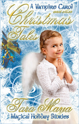
This will go on sale today or tomorrow. At the moment, it will only be available on Amazon and Scribed. The flash fiction pieces I’ve been posting on my blog are in there as well as The Dragon and the Angel, a short story (but not flash), an excerpt from the Unfinished Song: Root and an original urban fantasy novelette, A Vampire Carol.
I’ll have more excerpts up soon.
UPDATE: Now Available!
You could hire the most awesome cover artist in the multiverse, but if your text looks bad, your cover will look bad.
Case in point:
 |
| Bad. |
 |
| Good. |
So let’s talk font bling.
I use Photoshop, so I’m most familiar with how to treat text in that program. I’ll refer to how to do these effects in Photoshop, but I assume other equivalent programs can do similar things.
In Photoshop, right click on the text layer you want to enhance. Right under Layer Properties, you’ll see Blending Options. Choose that and a pop up menu will appear. In that menu, you’ll find most of the following options.
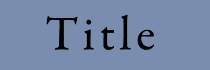
Here’s plain black text (Garamond Pro) on a medium dark colored background. We’ll gradually build up this text to experiment with various effects.

If you learn to do nothing else, learn to add a drop shadow to your text. The drop shadow alone can often make an amateur title look pro. Learn it, love it, use it.

Bevel and Emboss are what gives your text that 3D “pop.” Photoshop automatically adds the highlights to give these letters their depth. You can adjust the angle, but usually the out-of-the-box bevel and emboss looks fine. Again, just adding this, plus drop shadow, gives your text the self-respect it needs to hold its head high in the world of book covers.

Contour is like Bevel and Emboss, just a little more sharply defined. See that ridge down the center of the letters?

You can rough up your text a bit by adding Texture. This is easy to over-do, and too much Texture can make a font impossible to read, so consider subduing the effect by lessening the opacity or choosing a subtle weave from the Texture menu.

Inner glow can give a spooky or magical look to text. Not shown very well in this example. It works better with some fonts than others.


In addition to Outer Glow on the Blending Options menu, there’s another way to make sure the text on a cover is legible. Often, if the text is over a picture, some parts of the picture are too light or too dark and the black or white text disappears. A dark blob or light blob underneath can smooth that out. Here, I’ve used the paint brush, black but with only about 20% opacity, to brush a shadow under my title. Make sure your shadow layer is underneath your text layer.

This is the same as above, except with a white, light airbrush under the title instead of a dark one.

There’s no simple, reliable way that I know of to make metallic letters in Photoshop. It takes several steps, finesse and practice. Here I’ve done my best to make the letters look gold by combining everything above (except Stroke) and then choosing the Gold combination under Gradient. I’ve then added white highlights of varying opacities by hand.

Once you learn the basic effects, you can mix it up to get interesting combinations. Here I’ve added Texture to the Gold to make a Rough Gold look.
 Rayne Hall has published more than forty books under different pen names with different publishers in different genres, mostly fantasy, horror and non-fiction. Recent books include Storm Dancer (dark epic fantasy novel), Six Historical Tales Vol 1, Six Scary Tales Vol 1, 2 and 3 (mild horror stories), Six Historical Tales (short stories), Six Quirky Tales (humorous fantasy stories), Writing Fight Scenes and Writing Scary Scenes (instructions for authors).

(Samuel Rysdyk) Usually concealed within the middle of buildings, and hidden behind sliding doors, the elevator is inconspicuous, so simple and comfortable that it can safely be ignored.
Yet, this mode of vertical transportation is necessary to our modern skyline. The elevator is an invention that was 2000 years in the making. In 236 BC Archimedes used ropes and pulleys to create what we would consider an elevator. Yet, passenger elevators were not broadly installed until the second half of the 19th century. No particular individual invented the elevator. The modern elevator came to exist through a combination of evolutionary innovations. Mere mechanical parts were not enough to create the elevator; social “innovation” was needed as well.
Read the whole thing.
The technology for ebooks has been around, arguably, as long as home computers…certainly as long as the internet. Granted, this isn’t 2000 years, but still, for ebooks, as for elevators, there’s no single inventor. Before ebooks could transform commerce in literacy, the social system for reading and exchanging them had to exist.
General NaNoWriMo Stats Round Up
For NaNoWriMo main:
◦ 341,375 participants, up a whopping 33% from 2011’s total of 256,618 writers.
◦ We wrote a grand total of 3,288,976,325 words, up 7% from 2011’s 3,074,068,446.
◦ This averaged out to 9364 words per person!
◦ We had 38,438 winners, giving us a 11% win rate!
For NaNoWriMo’s Young Writers Program:
◦ 97,864 participants, up 21% from 2011’s total of 81,040. (Edited to correct an error in numbers!)
◦ We wrote a total of 419,152,844 words up 14% from 2011’s collective word count of 368,143,078.
◦ This averaged out to 5,077 words per person.
◦ We had 18,531 winners, giving us a 22% win rate!
This November, OLL had 37,120,542 pageviews, and a total of 5,939,711 visits: up 10% from 2011’s 5,384,040 visits!
Top 10 NaNoWriMo Cities (according to Google Analytics, based on number of November visits from these fine places)
1. London 118,030
2. New York 90,055
3. (not set) 72,912 (Probably Atlanta?)
4. Seattle 58,670
5. Toronto 52,686
6. Sydney 51,498
7. Chicago 49,290
8. Melbourne 44,689
9. Los Angeles 43,511
10. Denver 41,574
(Forbes) Kobo is the major player in the ebook world that you’ve never heard of.
This little upstart from Canada is trying to compete with the likes of Amazon,Google, Apple and Barnes & Noble….