Archive
Monthly Archives: October 2012
Monthly Archives: October 2012


I was wearing a gorgeous gown fit for a faery princess. A wonderful ball was being thrown in my honor, attended by all the people I most loved and respected. Delicious food and wine flowed unendingly. There was even cake, the absolute tastiest cake you could imagine. The man I loved most in the world had just promised to spend the rest of his life with me.
And I couldn’t take it anymore. I ran away in the middle of a conversation, hid in the dressing room, stared at myself in the mirror, despaired of my existence, and cried.
Yes, it was my wedding.
Why did I cry? Because I was afraid it was too good to be true–love can’t really last forever, can it? So I was just setting myself up to be destroyed. Because life goes by so fast, and then we wither and wrinkle and die. I still felt like a child, but here it was my wedding…before I knew it I would be staring into an old woman’s face, and into death. Because I loved my wedding dress and wanted to wear it forever, but now I had to change into another (also gorgeous) dress. Because no matter how much you want to, you can’t wear your wedding dress every day.
A release day is like your birthday or your wedding. You’re surrounded by friends, you’re getting presents, and you know you should be happy–and you are, you very much are–but never as happy as you feel you ought to be. Any little thing that goes wrong feels like the earthquake that destroyed San Francisco.
There’s plenty of emotion, including joy. But not limited to joy. There’s also anxiety, guilt, worry, despair at the transience of our own mortality (obviously, right?) and sheer terror.
At least, that’s how it is for me. I had a great release day–Wing reached #6 on Amazon’s Hot New Fantasy Releases–and I have all of you guys to thank for that. I don’t want anyone to think I don’t appreciate it. I do.
So don’t take it the wrong way if I confess that I spent half my release day swimming in joy and the other half fighting off an oil spill of black, sick depression. Admitting it, writing this, is actually helping me through it, as I can see how the two are intimately connected. High expectations, a long period of stress and the sheer terror of releasing my new book into the world, it’s all rolled together.
On my wedding day, my mom and my friends left me to myself in the dressing room for a while, as I requested, then came in, hugged me, re-touched my make-up for me, helped me zip up the new dress, and shoved me back out the door into the ballroom. There, while everyone watched and cooed, I danced with my true love to the strains of La Vie En Rose.
Here’s where you can buy it:
Amazon **
Kobo
Smashwords
Barnes and Noble
Amazon UK
Amazon DE
Amazon FR
Amazon ES
Amazon IT
** Please use only this Amazon link. There is currently a pirated copy on Amazon for $1.99.
If you haven’t started the series yet, you can begin the first book Initiate for free, here:
Amazon
Kobo
Smashwords
Barnes and Noble
iTunes
Sony
Amazon UK
Amazon DE
Amazon FR
Amazon ES
Amazon IT
–>
–>
–>
One more day…
With just ONE DAY LEFT to the release of Wing, I thought it would be fun to take a look at the book cover. What goes into the design of a book cover?
The first consideration is obvious: a cover should have aesthetic appeal. The image should caress the imagination, not assault the eyes. One mistake that some writers make, when they have control over their covers, is to want to stuff all the events of the book into the cover. Or they want to show a scene (not always a bad idea) with every detail exactly as it is in the book (always a bad idea).
For a lot of reasons, that’s not practical. Yes, sometimes the artist has time and a budget of thousands of dollars to hire models, make sketches, paint with oils, let the oils dry, die tragically young after lobbing off a few facial features, become famous after death, have his paintings posthumously sell for millions at auction, have other artists rip off his style in cheap knock-off paintings done in artistic slave factories in China, have one of those scanned into Photoshop, and finally (a crucial step) have all the heads in the scanned painting replaced with other heads, thus creating a unique picture which can be used as a book cover. But there’s not always time for that.
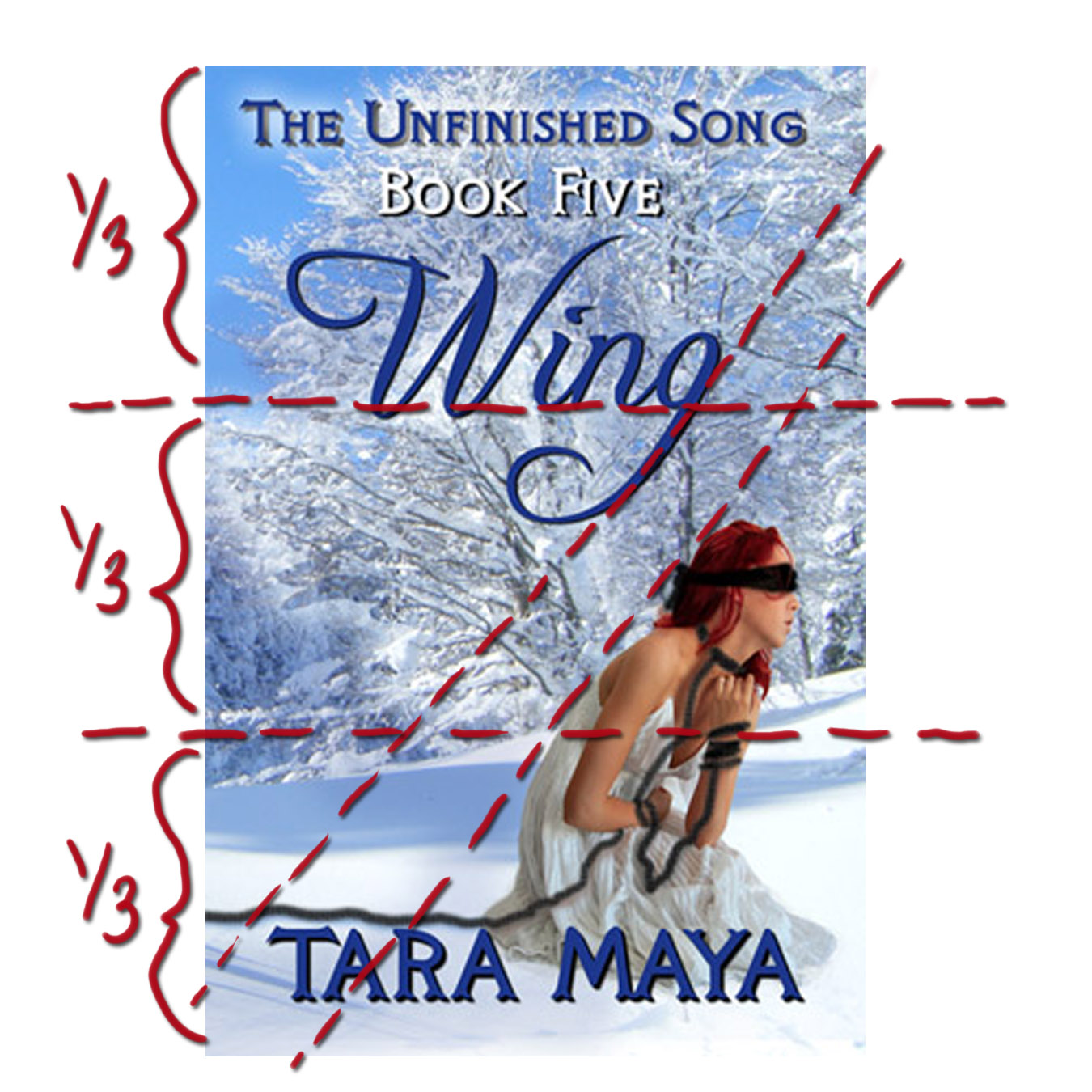
Instead, when you look at most covers, you’ll find they strive for a simple, striking design evocative of the mood of the book, portraying a main character, in a pretty dress. And it should follow the rule of thirds. You’ll notice that the sky and tress take up two thirds of the space; the human figure also takes up about a third of the space.
Wing is Book 5 in The Unfinished Song series, so it has to have some features in common with the previous books. The Unfinished Song is a twelve book series, but here’s a little secret–you can subdivide that into four parts, or four trilogies, each with their own story arc.
The first three covers all feature the heroine, Dindi, in her white Initiate garb, because the entire trilogy takes place over the year she is undergoing her tribe’s initiation into womanhood.
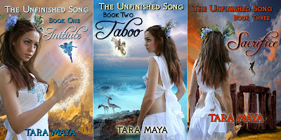
The first book shows Dindi against a mountainous background, because she travels from her clanhold in the mountains to a new place — Yellow Bear, where she will undergo the Test to see if she is worthy of becoming a Tavaedi. The little pixie shows that this is fantasy, and it will involve pixies…among other fae.
The second book cover shows the ocean, and a couple dragon-like faeries, because during this book. Dindi accompanies badass warrior Kavio on a peace mission to an enemy tribe, the Blue Waters, who live by the…wait for it… ocean. (They have a thing for sharks.)
On the third cover, we have a glimpse of the Stone Hedge where Dindi must confront the fae…among others. The winged figure in this picture is ambiguous, a little ominous… is it a faery? High Fae? Or Lady Death herself? This is also the first (and so far only) cover to show the corncob doll. The doll is show larger than described in the story, actually, because otherwise it would be almost impossible to see.
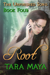
Root, Book 4, departs in some ways from the first three books. The actress is the same model (I’m not sure if you noticed) but she’s in a different outfit. Hm…doesn’t look too Neolithic in fabrication, but let’s hurry over that… The main point is that she’s no longer in white. She’s past her Initiation, and no longer quite so innocent. (Those aren’t tatoos on her face, by the way, but henna.) The green color scheme and forest background reflect the new lands the heroine is visiting. The black of her garment hints at a character who is not shown on the cover: Umbral, the Deathsworn who is hunting Dindi.
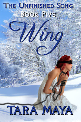
So now we come to the fifth book. Obviously, it’s important to preserve some of the same “look” as the series, while also hinting at the big conflict in the book — the fact that the heroine has been captured by her enemy, Umbral.
The unity of the series is maintained through the choice of fonts. It’s a good idea to never use more than three fonts on the same cover. Two is better. Here, and throughout the series, there are two. One for the title and another font for everything else. The exact position of the series name, book number, title and author name vary from cover to cover. Root and Wing, both part of the second trilogy, use a slightly larger font size for author name and title than the first trilogy.

Font choice is a standard feature for each book in the series. But obviously it’s important to make THIS book stand for itself too. Wing takes place over three moons, from the winter solstice to just before the spring equinox, and much of the time is spend on the slopes of mountains buried under winter. The dyed hair, black bindings, and faery dress all turn up in the book. The motif of wings also features strongly in the story. There’s no other reason for the blue and white color scheme, since the tribe they are approaching uses Orange magic. As I mentioned before, it’s more important to choose a color scheme that is visually compelling than one that reflects the events of the books literally.
Still…look for an orange-red color scheme in the next sequel, Blood.
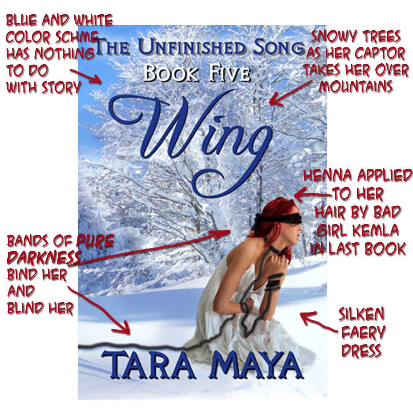
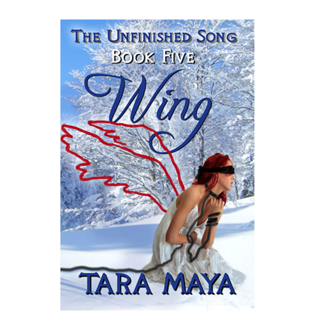
Sometimes it’s also possible to throw in nice extras to the design. Did you notice the shape formed by the pattern of snowy trees behind Dindi?
Chances are, you already have a good idea if you want to write a series or not.
1.) Expanse
2.) Medium
3.) Genre
But, duh.
So let’s move on to the other two factors besides expanse.
Historical
Of course you can. You didn’t need me to tell you that. But there are reasons that each genre tends to gravitate toward series — or not. And when we look at the different kind of series there are, we’ll see genre plays a big role there too.

Genre is the kind of story (science fiction, police procedural) and medium is the form the story takes–often impacting the audience and distribution. Think novel vs movie vs video game. Three separate mediums. Within the visual arts, the two main mediums are television and cinema. In literature, you have novels and magazines. (Just to name the most obvious.)
“The final test of a novel will be our affection for it, as it is the test of our friends, and of anything else which we cannot define. … The story is primitive, it reaches back to the origins of literature, before reading was discovered, and it appeals to what is primitive in us. That is why we are so unreasonable over the stories we like, and so ready to bully those who like something else.”